How Can We Help?
Play
This plugin is an add-on for Gravity Forms that enables a Range Slider featured. The slider is a dual handle range with a ton of features, and it is as small, lightweight and minimal as possible, which is great for mobile use, with full touch support.
Installation
Installing “Gravity Forms Range Slider” can be done by using the following steps:
- Download the plugin after purchase
- Upload the ZIP file (gravityformsrangeslider.zip) through the ‘Plugins > Add New > Upload’ screen in your WordPress dashboard
- Activate the plugin through the ‘Plugins’ menu in WordPress
Usage
Step One:
Create a new Form in Gravity forms, or select an existing form.
Step Two:
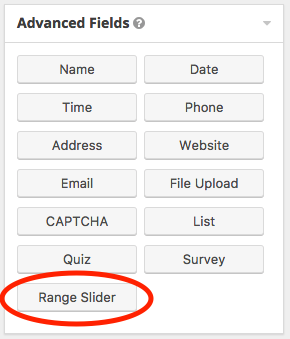
Open the Advanced Fields tab within the form editor, and select the Range Slider.

Step Three:
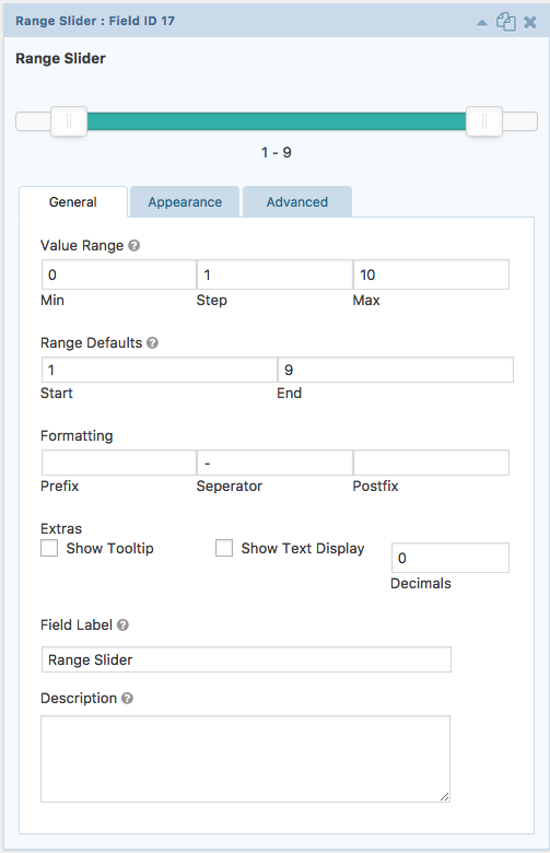
Adjust the options for your range slider:
- Slider Type
- Single Slider: Select whether to use a single slider or a range slider.
- Value Range
- Min: Minimum value of the range. Default minimum value is 0.
- Step: This is Step scale factor of the slider, default value is 1 and only allowing integer number unless minimum value is non integer number.
- Max: Maximum value of the range. Default maximum value is 100.
- Range Defaults
- Start: Set the value the first handle should start at.
- End: Set the value the last handle should start at.
- Formatting
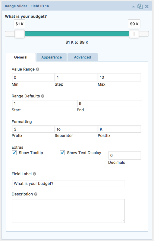
- Prefix: A character value that will show in front of the values, typically used for adding a currency symbol to values.
- Separator: A character value that will show between the values, default value is a dash [ – ].
- Postfix: A character value that will show after the values.
- Extras
- Show Tooltip: When active, display a tooltip above each slider handle with the value.
- Show Text Display: When active, display the current values of each handle below the slider.
- Decimals: Sets how many decimal points to show with the values.

