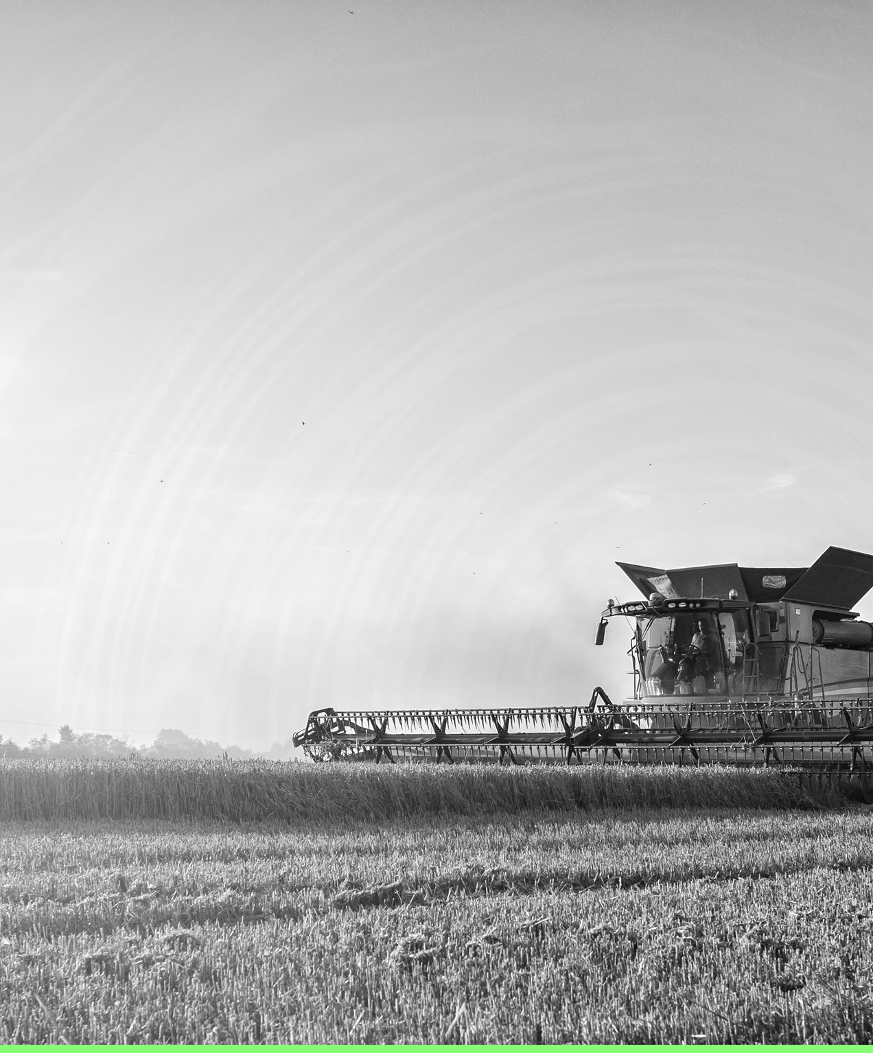
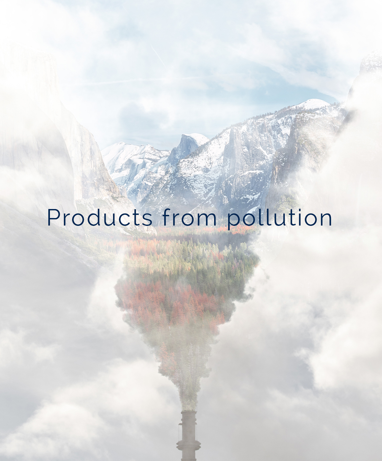
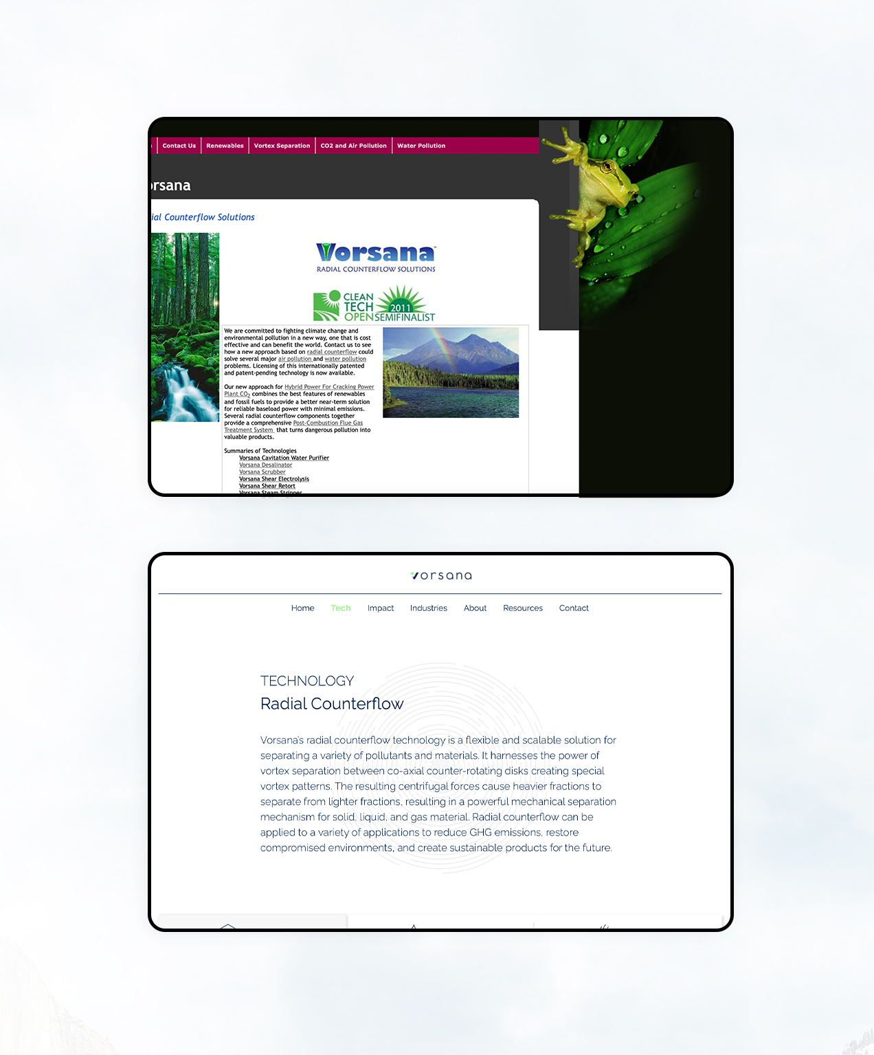
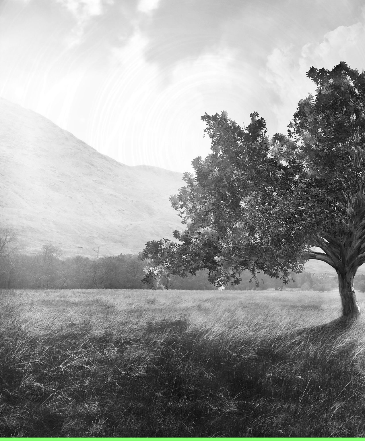
Vorsana: Matching Innovative, Environmental Products With Clean User Experience Design
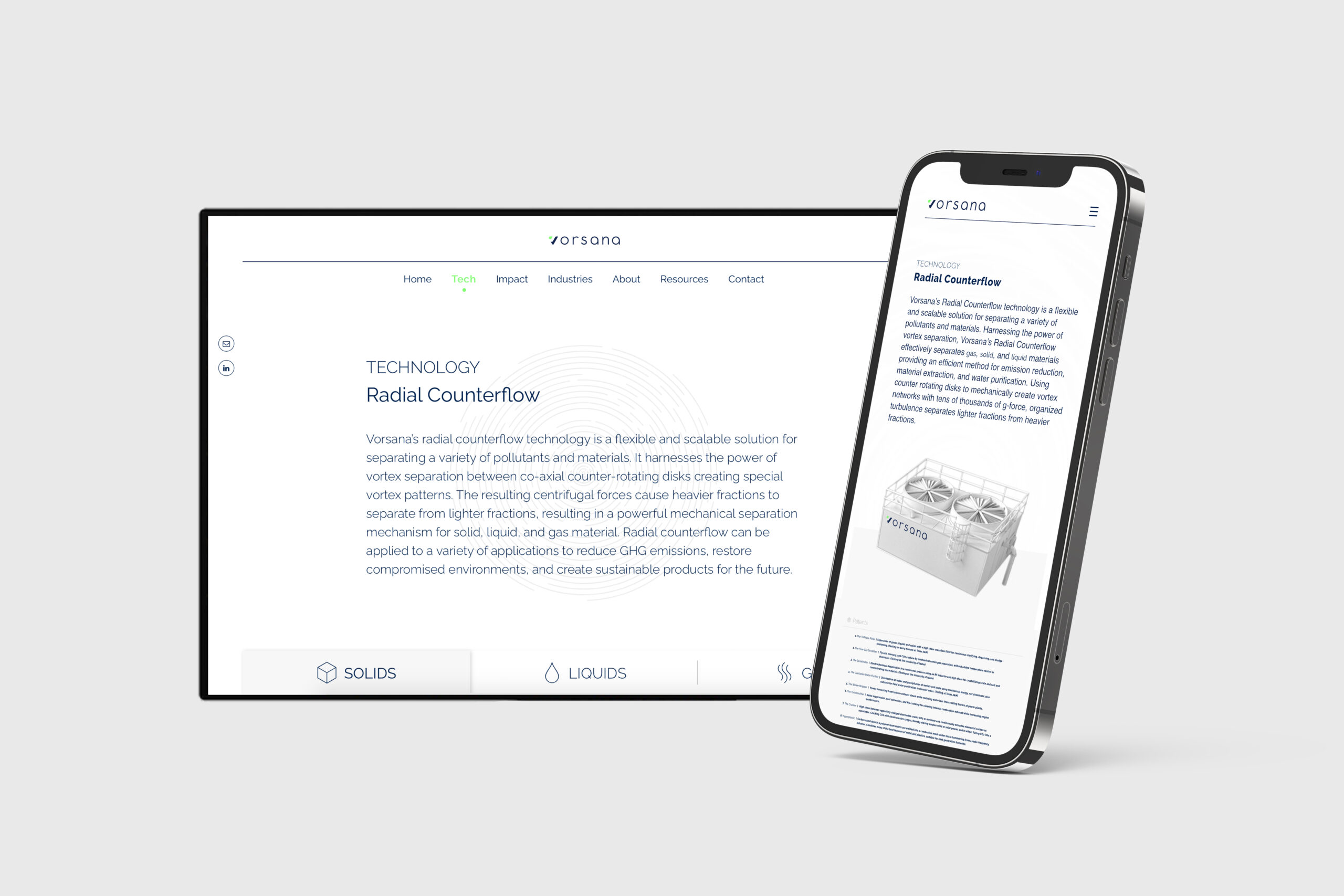
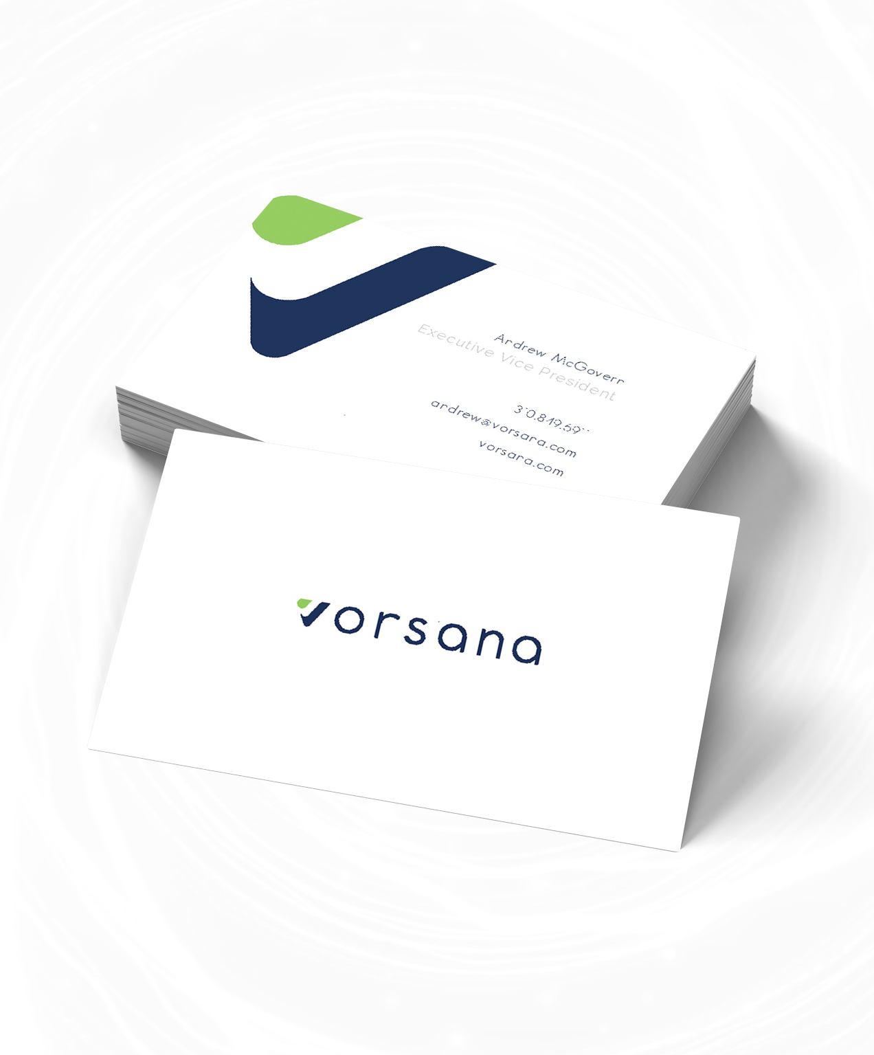
If people don’t understand what your product is, it’s going to be challenging to sell it. The original Vorsana website included a lot of technical language, which caused a disconnect when seeking out investors for the project. With the goal to provide investors easy to understand information, we simplified their user experience to make it clear what they offered and how it works. We also designed a new, modern logo for them that spoke better to their company and brand.
Keeping the Flow Going
Crafting an intuitive user experience for your website ensures users don’t feel overwhelmed or spend time attempting to understand how your website or products work. We used simple geometry and a clean design to make navigation and content digestible.
Jargon Only Means Something to You
Technical language will only be helpful to those that understand it. If your target demographic doesn’t possess that knowledge, then you’re preventing them from truly appreciating how amazing your products or services are.

You might completely understand your product, but your target audience needs to be able to understand it clearly too.

Making It Memorable
A good logo will not only represent what you do, but also be easily recognizable. We designed a modern logo for Vorsana that expressed both their environmental impact through the use of green and their modern approach through their font and dark colour.
Step Into the Future
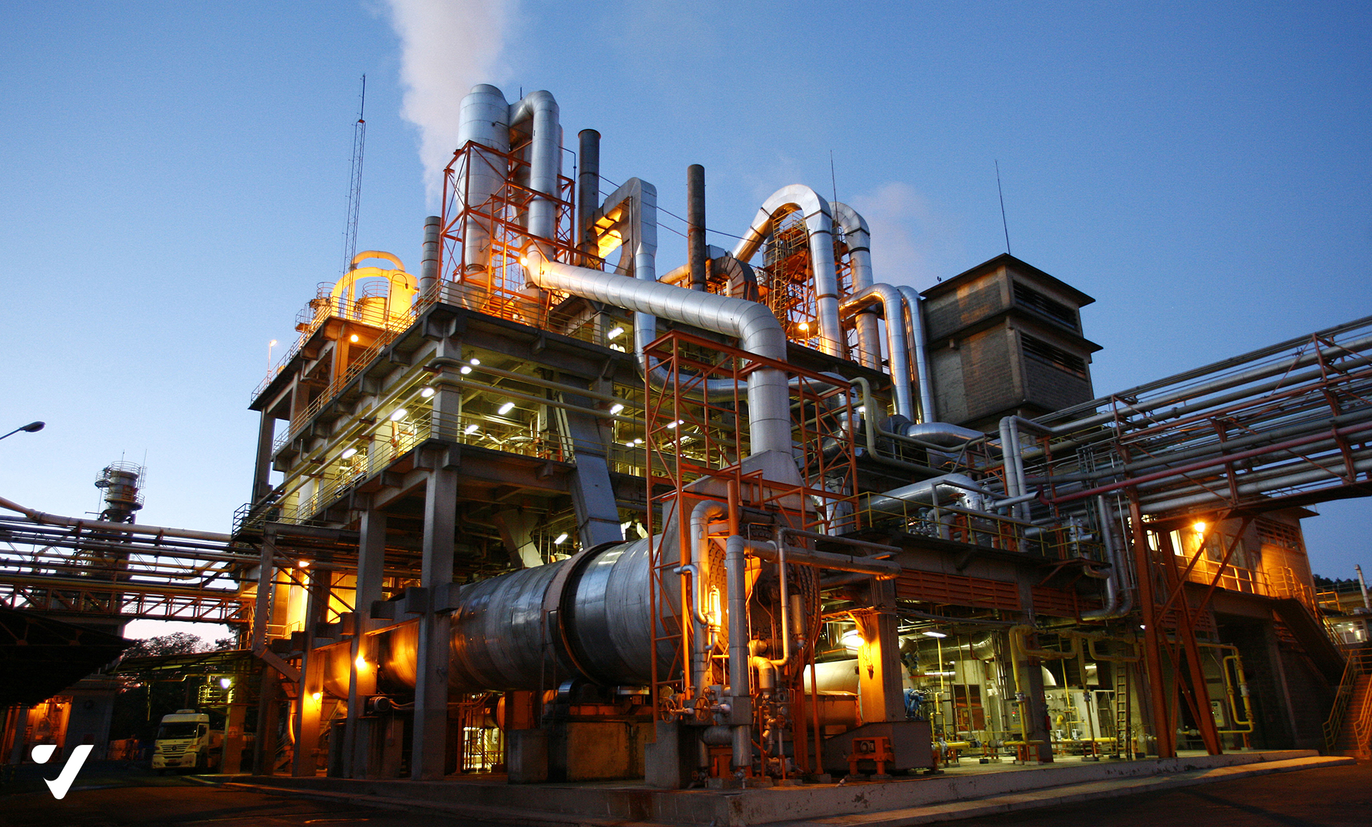
If you’re a modern tech company, you need a modern look. People will associate your technological products as behind-the-times if your website looks like it’s from the 90’s. We used a current design with minimal elements to ensure that potential universities, investors, industrial plants wouldn’t get overwhelmed by.
How We Helped
Team
Project Manager: Emilia Muscardin
Graphic Designer: Mitch Mills
Web Development: Heather Treadgold
SEO: Patrick Henderson
Content: Emilia Muscardin
Related Work
Rosebuds
Rosebuds Designer Consignment Brand Revitalization To overcome the challenges faced by Rosebuds Consignment, our team proposed a comprehensive solution to revitalize their brand identity. We embarked on a brand revitalization journey, focusing on modernizing their branding while maintaining its feminine and sophisticated appeal. Deliverables: Brand Identity Design, Web Design, SEO/SEM Setup, Photography Logo Redesign The [...]
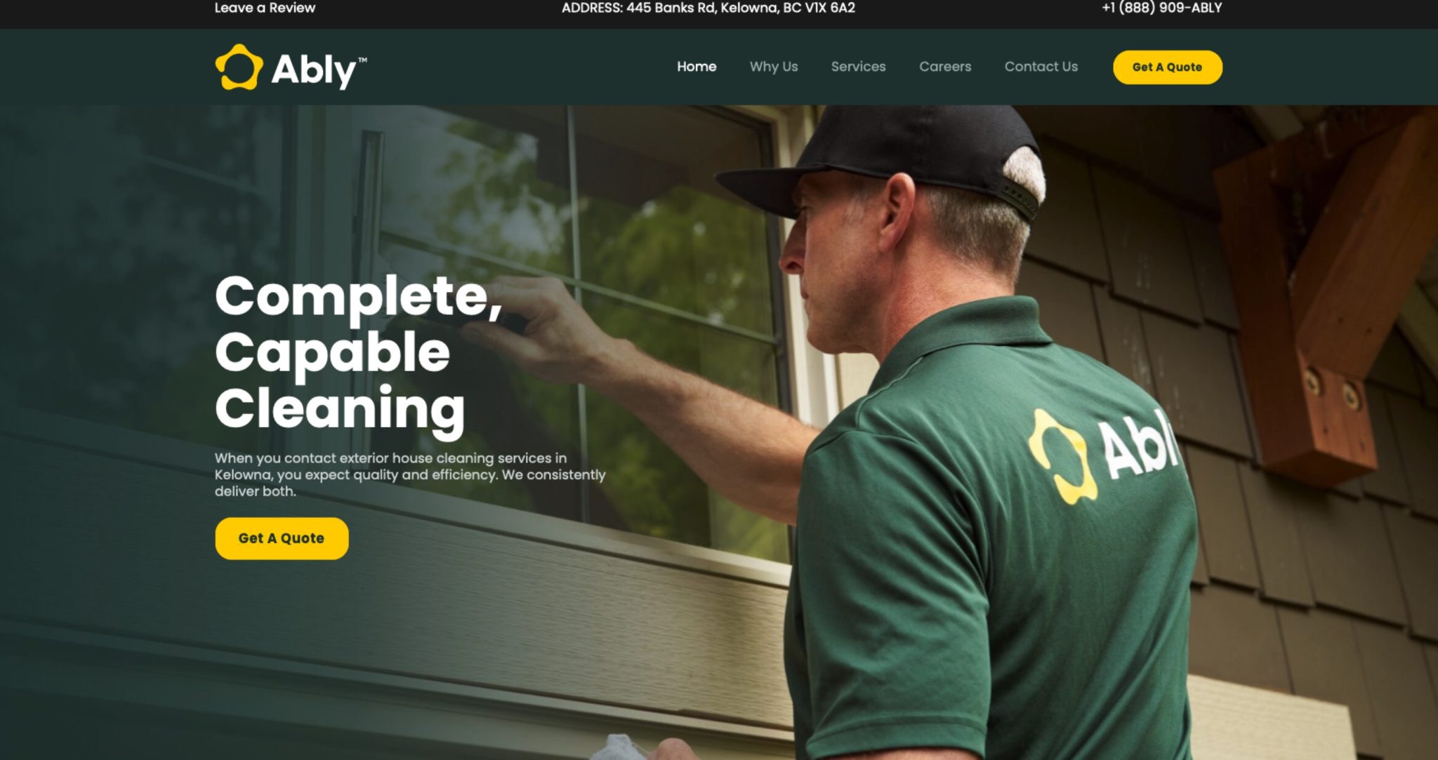
Ably Clean
Deliverables: Branding, Website, SEO, Content, Signage, Social Media Client Mission Our mission was to jump-start Ably Clean, a fresh exterior maintenance company in Kelowna, BC. This involved rolling out a cohesive brand, creating eye-catching signs, designing striking vehicle wraps, and building a user-friendly website. Our Journey Our journey with Ably Clean began by defining and [...]
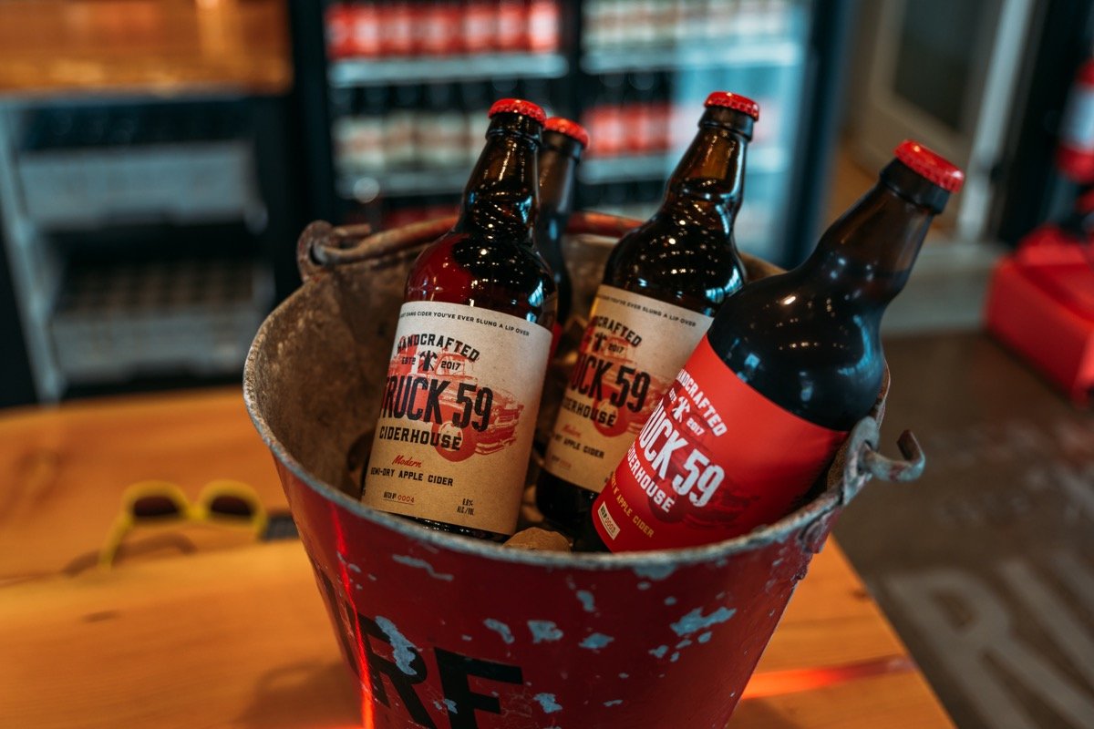
Truck 59
Truck 59 Ciderhouse Client Mission Amplifying Brand Presence in a Saturated Market In the bustling world of craft beverages, Truck 59 Ciderhouse faced a critical challenge: enhancing brand awareness and expanding its reach in a market brimming with options. Despite offering a unique blend of flavors and experiences, Truck 59 needed to distinguish itself and [...]