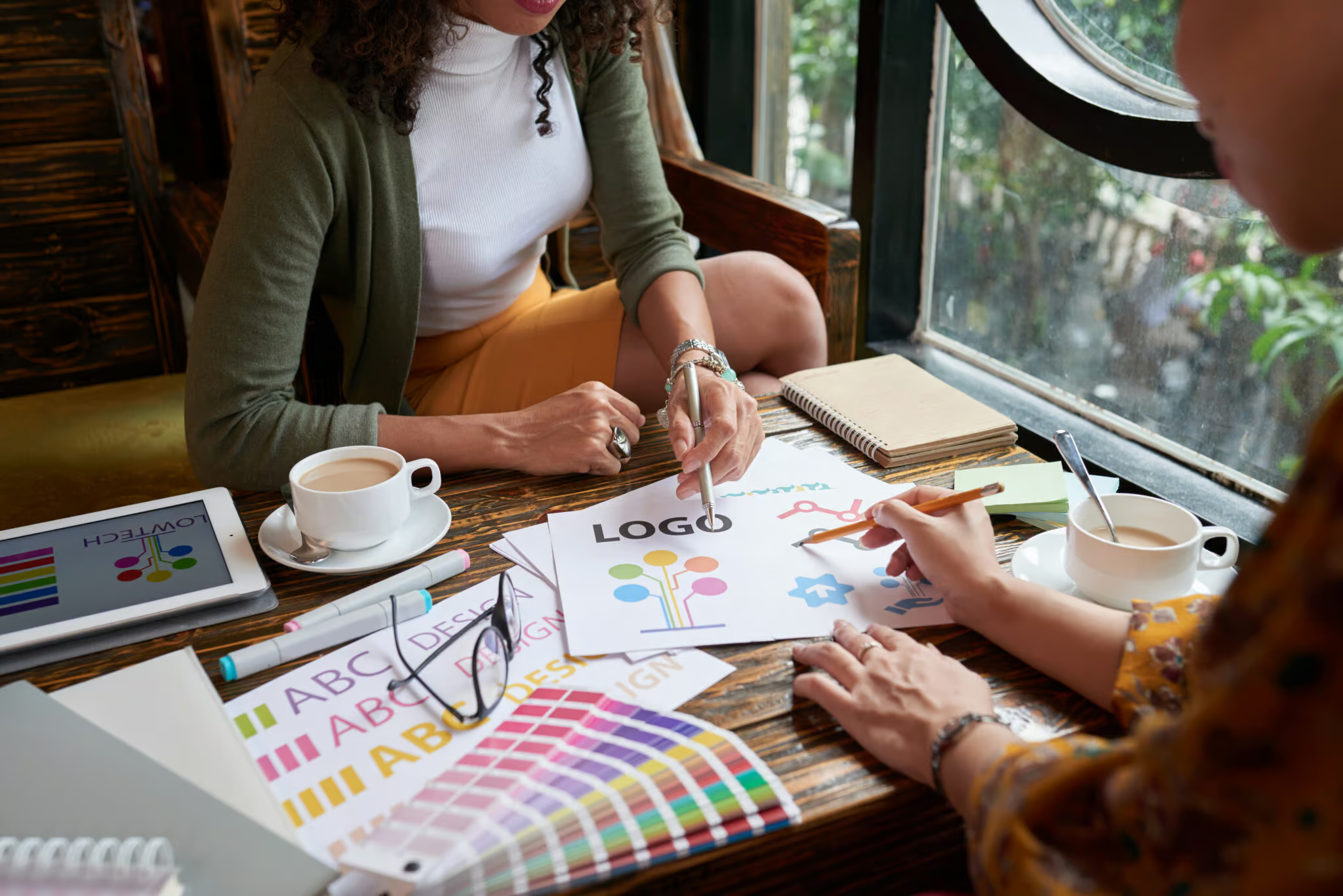
 Cool logos are everywhere nowadays with new companies popping up each day, and existing companies rebranding or redesigning their own. A logo is the main embodiment of a business and the design of it shouldn’t be handed to just someone off the internet who took an Adobe Illustrator class once. A business is often reflected through a logo and a good logo sums up just about every aspect of it through one simple design.
Our Chief Brand Officer, Tina Walczak, and Content Strategist, Jake MacLaren had the opportunity to discuss how to create cool logos with James Martin, a high–profile logo designer.
Below, they discuss the elements of a great logo, the golden rules of logo design to make cool logos, and the main characteristics of a good logo. They also go over what makes up a bad logo, and what pitfalls to avoid when creating one. Read the full transcript below for all the details.
Jake MacLaren: What are the elements of a great logo?
James Martin: What are the elements that create a good logo?
I suppose it depends on the brief, and the client. I feel a great design has to do two things: for starters, it has to be minimal.
A minimal design should tell some sort of story and there has to be some sort of meaning and reasoning behind it. I think there are thousands of logo designers who can create great design, but there’s not many that can tell story within that great design. So I think I think for me, the elements that make up a great design need to work both big and small and has to translate easily across multiple cultures. It does depend on the industry because some logos need to be embroidered, but some don’t, some logos are used online, some logos are used offline, and so on. At the end of the day, I could create cool logos, but if the clients don’t like them are they even great? It all comes down to a personal opinion, a great logo should make your client happy.
That’s why I, share my process. I like to teach people how the brain works, how the ideas come from a chat, or a client brief. Many people often like to keep their knowledge for themselves, but, the more I share, the more I love sharing.
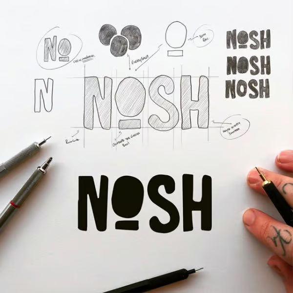
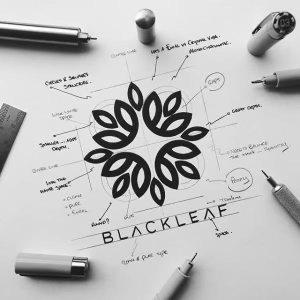
I think that process and that story behind it is also a great way to sell design. Seeing a design is not enough anymore, I share the sketches, the story, and the thought process with my clients. It’s almost like I’m bringing them into my head and they’re seeing what I’m seeing as I’m creating. That’s why I like drawing is where you can get so much more of an emotional attachment to something that’s drawn and made by hand rather than just put straight into illustrator. Sometimes I get logos right first time, sometimes I don’t, but I enjoy that process even when it’s wrong. You learn by doing and I have learned more from when I’ve been wrong than when I’ve been right.
 Jake MacLaren: Let’s say I’ve already got an established logo for my business, but I want to make it better. How can I make my logo more attractive?
 J
JJames Martin: Start over. You can make an attractive logo, but you can’t make a logo more attractive if it’s already not.
I’ll get a lot people kind of coming to me with designs and saying, “I’ve got this, can you take this idea and create something?” I never take on projects like that. I don’t feel I can give myself to that kind of project. Because if there’s something wrong with the logo and it needs to mean something to make it better, then there’s a fundamental reason for that. Maybe it’s just not a good logo.
So I would always urge people to rather than invest a little bit of money on trying to limp something along. It’s better to kind of step back, and reflect. What are your issues with it? Then you can address all these elements and create something fresh and new.
It’s not to say you can’t take inspiration from some elements in there that do work. But I would always suggest to start again. There’s often a bigger issue than just changing a color or adjusting the angle. You’re way better off spending, investing that time and effort into making something brand new and creating something that will last forever rather than limping on with something. You can make an attractive logo, but you can’t make a logo more attractive if it’s already not.
Jake MacLaren: It’s better to start anew then try to put a Band-Aid a logo.
James Martin: Yeah. A clear deck is quite inspiring as a designer because you have the ability to make anything. Whereas if you’re concentrating too much something that’s already there then you’re preventing what it could become.
I think it’s important to say goodbye to stuff, which I know is hard because some people have an attachment to ideas and existing material. But if they’ve already highlighted that problem, “I’ve got this logo, but there’s something wrong with it. Can you make it better?” My reply would be, let’s start again and create something great, something that will last forever rather than patching this one up and making it last another year until something else is wrong with it.
If you do some changes, you can actually make cool logos worse by adding to them. So, start again, start afresh. Clear your palette and all the rest of it and create coolness.
Jake MacLaren: How many colours a logo should include?
James Martin: A logo, whether it’s got colour in it or not, has to also work black or white. You know, there will be situations where it does need to work in that particular way and if it looks good in black and white, it will look good forever.
When I do use colour, I would always use a maximum of two colours, and allow yourself the black and white option in addition.
However, it depends on the industry, if the company is an athletic wear company, and their logo will be printed in colour, suddenly the colours you put in the logo won’t look good if they overlap, like red on red.
Also, printing three colours is more expensive than printing two colours which is more expensive than one colour.
From my point of view, I don’t like to really use any more than two in all honesty. Maybe like one bold colour and one passive colour. One of my go–go projects was kind of like a bright red with a purply tone that worked quite nicely. If you start to add any more in than two colours your logo can start to dilute the brand a little bit.
As a brand, a multiple colour palette which you use and choose and pick from is good. But when it comes to the logo, I think there have to be some stringent rules with it. So it’s always used with this colour on this colour, or this colour on this colour, rather than if you have like seven or eight colours and dilute it. Especially if you’re in an agency setting or in a bigger business. Restricting those rules in the beginning by keeping this logo super clean, super simple with maybe one or two colours, you can go and do whatever the frick you want with it because the colours will always go with it. Whereas I think if you tie yourself to too many colours within the logo, suddenly it’s very difficult to play around over here.
I was always kind of err on the side of caution and have a cleaner logo and allowing yourself room to grow into it. Times change, trends change, colours come in, colours go out. When there’s a popular colour, suddenly everybody has that colour. And now you look like everybody else, even though you might be the first, so you’ve got to allow yourself that kind of wiggle room.
Obviously, the bigger brands like dairy milk companies won’t be changing from purple, for example, and Coca-Cola won’t be changing from red. I think it’s important to take control of yourself in the early stages and build the brand, you know, in a way you want.
Jake MacLaren: Still on the topic of colour, what colour attracts the most attention?
James Martin: It does depend on the industry. You know, there’s a lot of really good punchy colours. A good combo is a super bright colour with a black. It seems to be quite a cool thing that’s happening at the moment, which I really, really love. But it can only work for certain brands. You have to be slightly rebellious and slightly edgy character to be able to pull it off. But, you know, I’m really liking the kind of holistic lifestyle kind of pastel tones going around at the moment as well. But again, you know, if you’re trying to be punchy and, you know, shouty with your brand, those won’t particularly work. So, you know, I think I mean, for me, it does depend on the industry and obviously the tone of voice.
Colour can make a great logo look awful. It can make an average logo look great. I’m always very wary of sharing different kinds of variations and tend to show colour as a last thing. I will mock it up depending on the industry. But we should always make sure we nail the logo first, and then if you want to add colour, we can then explore that because it’s as I said, there’s so many different emotions and so many some people like blue. Some people do. You know, it’s not because of what Blue stands for is just they don’t like it, you know, not that emotional attachment to color can take a logo over the line or make it stop that. So I’m always very wary of introducing colour too early in the logo process because I’ve had some great designs that I’ve kind of gone by the wayside because colour has been involved.
Next time you want to add colour, ask yourself these questions; does it suit the industry? Does it suit our values? Does it suit who we are? Does it get our personality across?
Jake MacLaren: That’s really interesting. That wasn’t something that I would have considered I did. There’s an element of bias when you’re creating cool logos. You start with the black and white version and you build from there. I think it’s easy for us like anyone to kind of get influenced by something where, like it’s not totally like “finished,” I guess. Yeah. And then just being like, oh, this colour doesn’t obviously work. The rest of it doesn’t work at all. Yeah. That’s not the reality.
James Martin: That is not the reality. They say it can, you know. And also depends on how many people in the room. John. I mean us. The other thing, you know, if you’ve got your show and this low to four or five people and for them like it and one of them does, that logo wouldn’t get overloaded. So get that logo over the line and then let them squabble about colour afterwards, because otherwise, you’re going to be constantly doing this. It’s not easy. If you’re looking after one person, what a one. So I kind of explain that process right from the beginning. Let’s nail it. Black or white? I’ll mock up and some cool things. If there’s an obvious colour, which I think would work great. I’m going to show you. But let’s now let black Hawai less fall in love with the design and then push on and introduce colour and see if it adds or takes away sets that can happen. It can do Easter.
Jake MacLaren: What are the characteristics that make up a great logo?
 Ja
JaJames Martin: It must be versatile across applications. It needs to work both printed, and on a screen, signage, and so on. It must work.
It also should tell us a story in one second.
It should be clever. It could play with negative space. It could be a hidden letter or hidden elements. Think of famous cool logos like Amazon or FedEx, you look at them and you go, great. And then somebody points stuff out and you think to yourself, I never even knew that existed.
I like the kind of cool logos that keep on giving. I think it has to be timeless as well. I think it must last forever. Cool logos are not supposed to last for a year, they’re supposed to last a long time. I would say at least 10 years. If it’s not, you know, ideally forever.
A good logo should start a conversation. What I mean by that is it must get people interested enough to talk about it. You want people to be intrigued by it. Approachability makes people want to unite with it and interact with it as well.
Jake MacLaren: What should people think about prior to getting a new logo?
James Martin: I think some people try to overcomplicate their cool logos. I guess it comes down to application. A logo can look great on a screen, but if you shrink it down as if it were on fabric and if it’s still recognizable then that’s a good logo. If it just turns into a black mush, you know you should probably start again or simplify a bit. So, yeah, probably the biggest mistake that people do is they try and overcomplicate their logo. “Less is more.” It’s a classic quote when it comes to timeless logo design.
Jake MacLaren: How do you like to work with clients? Do you have a set of golden rules of logo design?
James Martin: Just listen to the client.
Some logo designers think they’re rocket scientists or brain surgeons, but we are just logo designers, we’re not curing cancer. Let’s not get ahead of ourselves.
Collaboration and allowing yourself to be wrong is super important. Allowing yourself to accept that your wrong is super important and collaborating with clients is a must. You got to take control of the process and keep focused on the job in hand. But allowing open conversations can create a design that is loved. If my client isn’t happy with their logo, I will make sure it gets to a place where they are happy with it because they have to own it.
It’s so much easier to spend time with something and sell something that you personally love. I would hate to ever think that somebody I did some work for was forced to use my design. I’d never do it. That’s why I do an unlimited revision policy just because I want them to be happy.
My best work comes through collaboration, and I think some of the best work on the planet happens through collaboration. That’s in any industry, any government, or whatever. You’ve got to collaborate, you need other minds to see stuff that your mind would never pick up. That’s why I do like collaborative work. Let’s work on figuring it out and putting some heads together.
Want James to design your new logo? Check him out. Addicted to logo porn? Explore his Instagram page.

Photo: James Martin