Accessibility in Website Design for Health Services
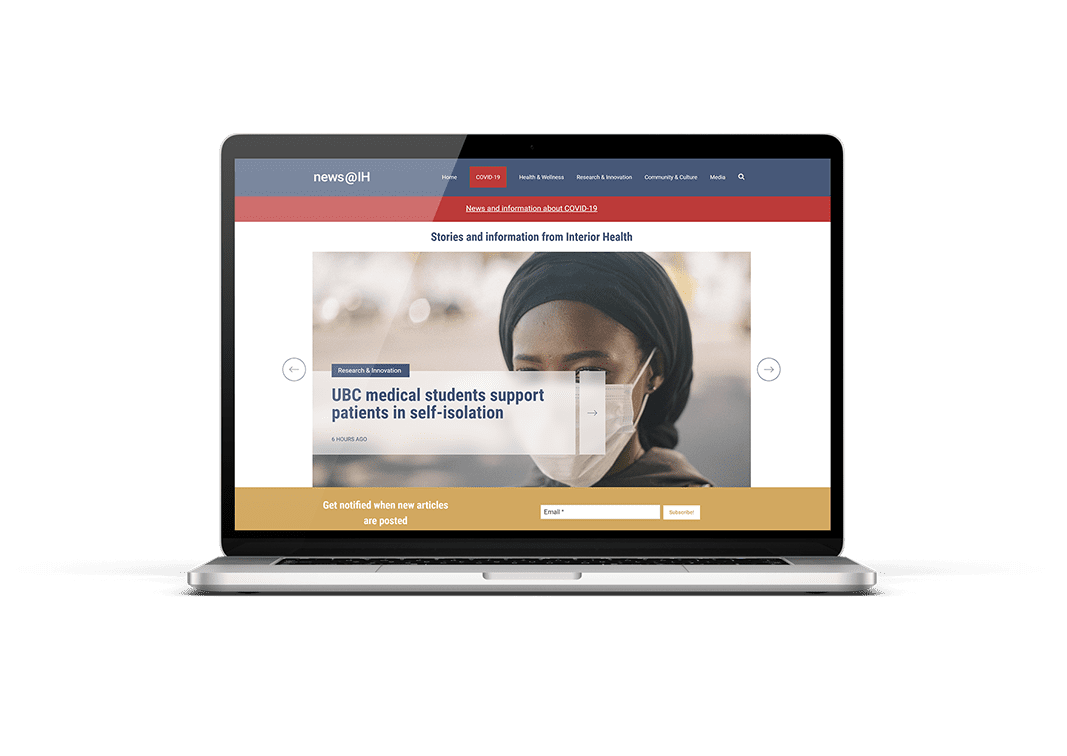
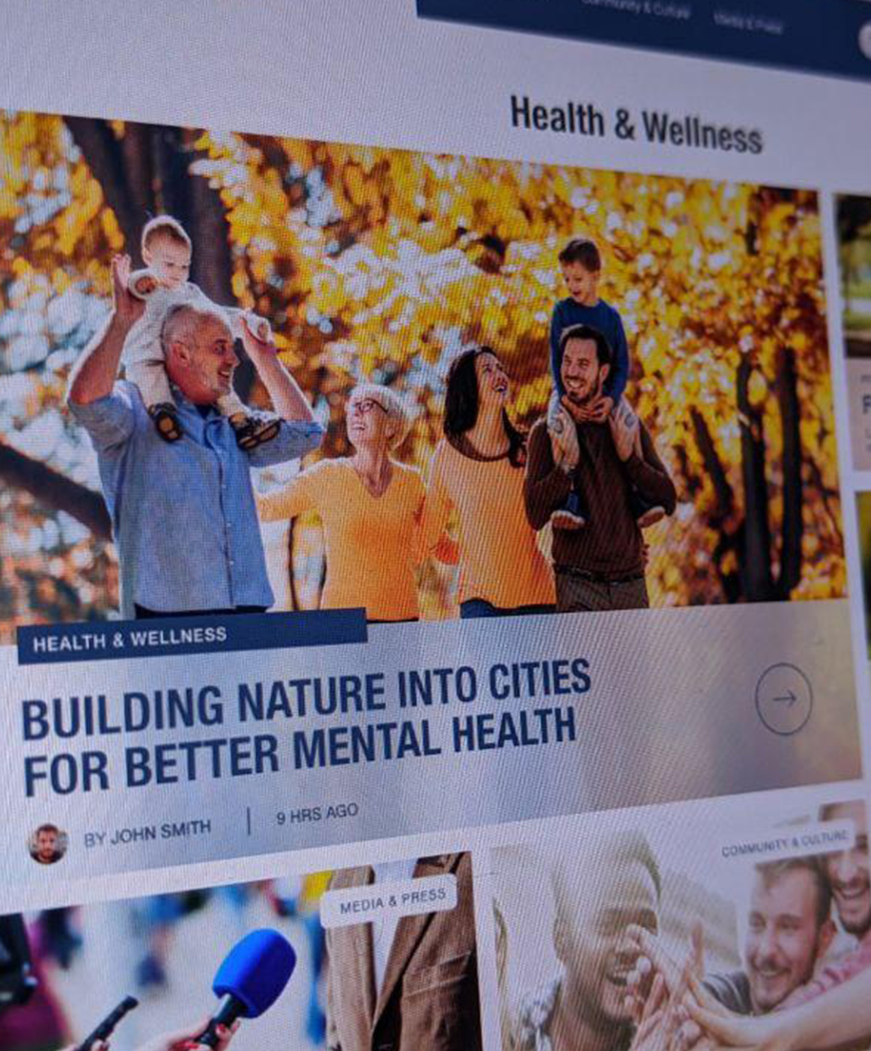
Interior Health came to us because they were having a challenging time getting staff to engage with their online news portal. We helped them redesign and rebuild their news site to be clear, simple to understand, and easy to read for people of all ages. User experience was a high priority for them, and we achieved this through a minimalistic tile design, bold titles, and straightforward navigation.


Keeping the user’s journey a top priority
Life often doesn’t go the way we expect it to, which was the case with the COVID-19 pandemic. We worked with Interior Health to transition their news portal to become public facing. This allowed community members access and stay up-to-date on pandemic news.
We knew that people of all ages – including seniors with impaired vision – would be viewing the site. Our team made sure to keep their browsing experience top priority, making sure to include enough contrast to be easy on the eyes and using bold typography to help headlines stand out.

Stress-free navigation is crucial
A clear hierarchy within the navigation and content help draw in the user while making the information easy to understand. People don’t want to spend more than a few seconds looking for information, so we included clear sections within the top-level navigation to categorize the types of content into multiple mini portals, each with a different topic of interest.
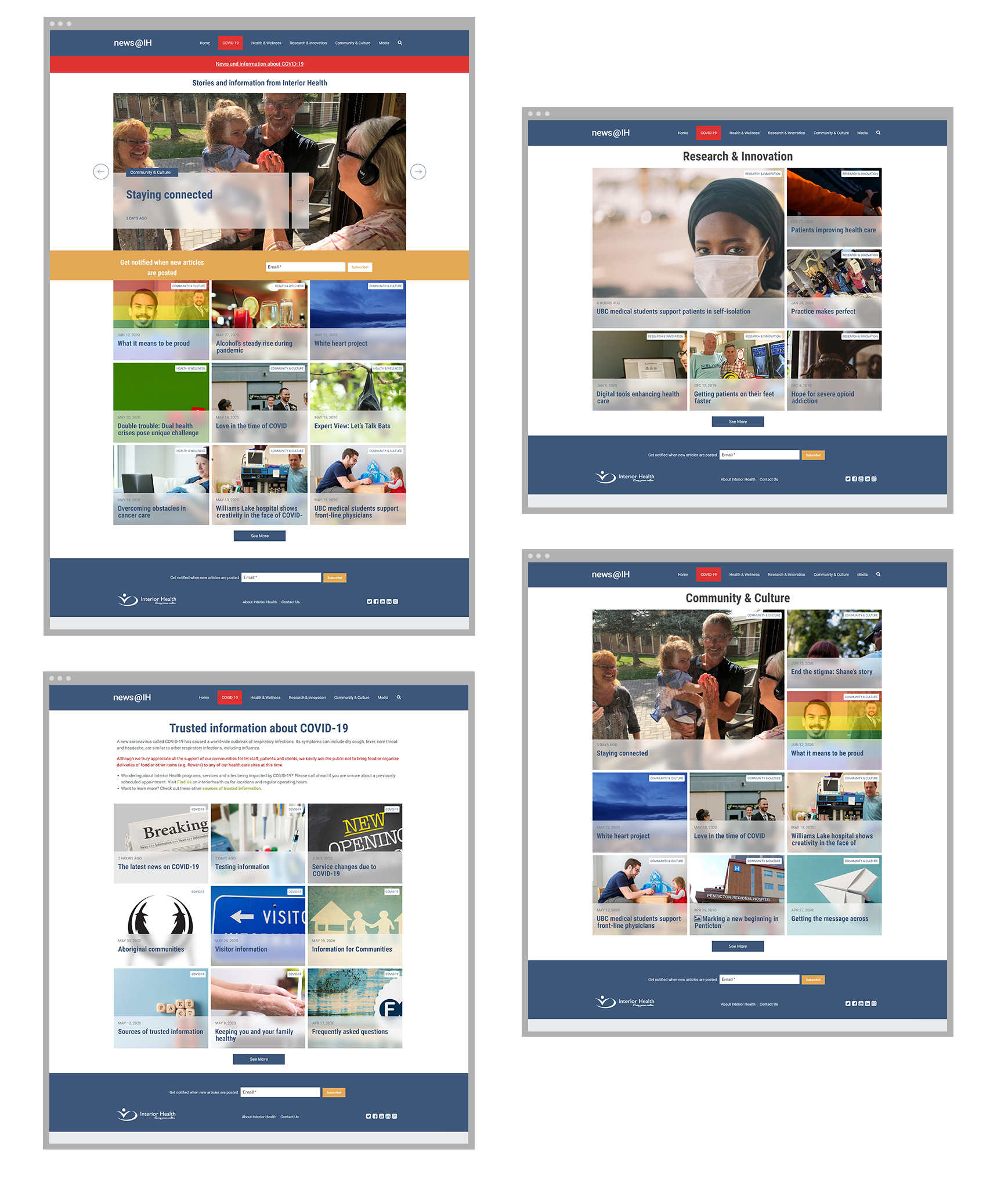
A site’s structure should make sense to anyone visiting your site, regardless of their purpose so they don’t get lost and frustrated.
Positive imagery and clarity in design
Uplifting imagery and eye-catching visuals helped add an element of positivity to potentially stressful topics.
Our team also added a unique custom “frosted glass” effect to complement Interior Health’s existing brand while also helping the content immediately stand out.


How We Helped
Team
Project Manager: Liz Dunning
Graphic Designer: Mitch Mills
Web Development: Heather Treadgold
Related Work
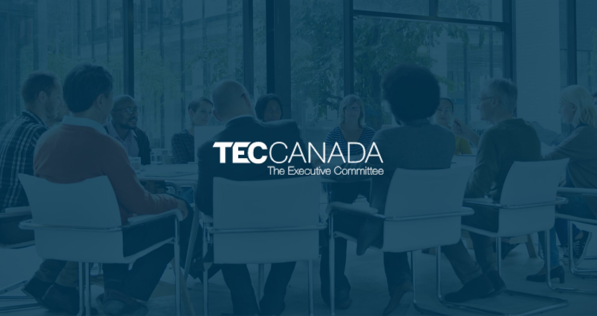
TEC Canada
TEC Canada For TEC Canada, our mission was to give their online presence a fresh and modern look, enhancing the user experience and clearly communicating TEC Canada’s purpose and offerings. Through strategic updates, including event post improvements, streamlined resource organization, and revamped recruitment pages, we successfully transformed their website into a modern and engaging platform [...]
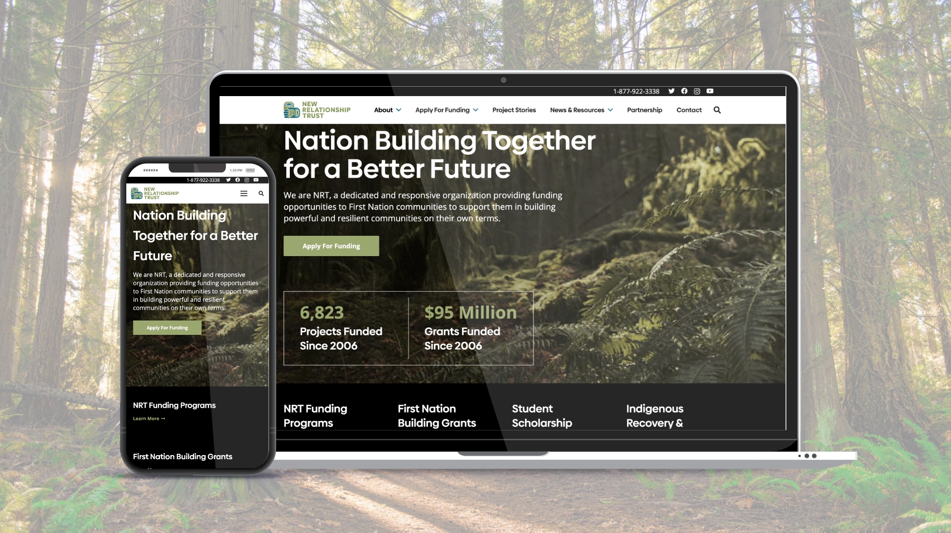
New Relationship Trust
New Relationship Trust We were asked by New Relationship Trust to help them re-design their website with two main goals. First, to align it with their new branding and, second, to improve their content structure and enhanced user experience. Deliverables: Web Design The Challenge The Client Faced To fulfill New Relationship Trust’s first goal, we [...]
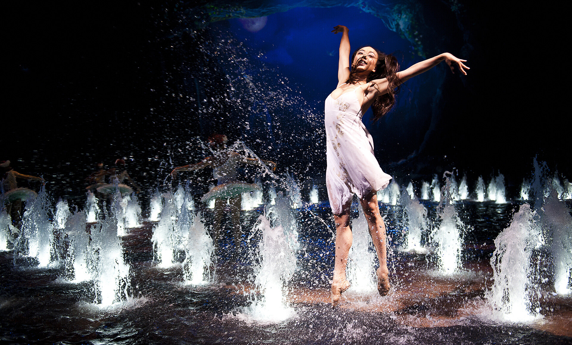
Dragone
Showcasing the Spectacle of Dragone's Artistic Vision In a world where entertainment is constantly evolving, Dragone needed to not only showcase their spectacular productions but also convey the depth and innovation behind their artistry. The goal was to create a narrative that captured the essence of Dragone's work, highlighting their unique approach to storytelling and [...]