Last week we sat down with one of our clients and they asked us: “You’ll make a mobile and tablet version of my website too, right?” We love questions like that and jumped on the opportunity to explain that the way we design our clients’ websites is through the utilization of a method called responsive web design.
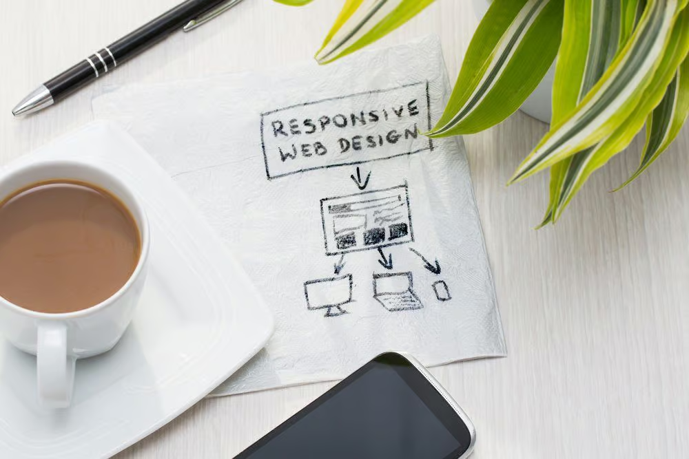
Responsive Web Design 101
First off, allow us to explain what responsive web design is and what can be expected of it in relation to today’s technology. It’s no surprise that in 2014 a significant number of Internet users switched from using their desktops to their mobile platforms for browsing purposes. We live in a culture that is always on the go and we crave the ability to access more information as quickly as possible, and mobile sites can do just that. Not too long ago, we designed separate sites for mobile that were not transferable across all platforms. The remedy to this tedious task was something called responsive web design, which uses proportion grids, flexible and scalable content, as well as providing an information-rich web experience for the user. This is essential, because the way a company’s mobile version runs is often a distinguishing factor in how reliable and proficient their services are. Users (who ultimately should convert into consumers) expect easy navigational tools, a swift search and discover method, and fast response time when visiting websites both on desktop and mobile. So what better way to identify how to implement these “must haves” than having your very own Kelowna web design company Hiilite the essentials for you?
Design with all Platforms in Mind
The key when starting any web design project is to set out your requirements – what do you want the site to look like, and what you need it to do for you? Once you’ve established that your next step is to lay out your thoughts and ideas onto a wireframe, which is essentially the frame work for your website. When designing your website that there are ideal layouts for responsive design and some that just won’t do.
Some interesting factors to help you decide on the best layout for what you want to achieve are:
- How your website will look on anything from small to extra large displays (as we use TV’s to view web now too).
- The design for mobile usage first, considering the key components you want to get across on such a small platform.
- Avoid implementing fancy Javascript or Flash features that may eventually crash the site.
At Hiilite we understand the fundamentals of responsive web design. Trust us to get you the best results.
Minimize Unnecessary Content
Sometimes the content you love and want on your website just doesn’t transfer well onto a mobile platform. Although our mobile devices are getting bigger by the day, the screens are still quite small compared to our desktops.
The best way to cut down content clutter is to follow these simple practices to focus your message and marketing strategy:
- Be ruthless and strategic with the elements you choose to include.
- Question why it must be included and establish its purpose before cutting it out.
- Design your content with mobile in mind.
- If these features must be included on the web platform, have your web developer go in and magically remove them from the mobile platform.
Speed Kills
What is the biggest deterrent from people visiting your mobile site? A site that has the loading speed of a turtle. If your website is packed with content that has a long load time and a web set up that isn’t speedy in the first place, you’re guaranteed to lose visitors to your site. And those who do visit may not have the patience to stay. Consider sacrificing image quality (which we will cover below) and nixing redirection links (that also can harm your search result index). When it comes to the Internet, the tortoise never beats the hare.
Use Appropriately-sized Images
Large images increase the time it takes your website to load which may lead to a high click-off rate. As web designers, we want to find a balance between page performance and rich visual components which means that sometimes we need to be diligent in removing the items that are not crucial to performance. We also want to urge you to choose images that are going be flexible with the responsive design. This means using adaptive images that will look the same when scaled up or down, which is key to maintaining a cohesive design.
Coding Cross Compatible CSS3
This is that web developer magic we were talking about before. Using cross compatible CSS3 that fully utilizes media queries means that we are able to style different rules across different devices. We are not coding separate websites for different platforms, but looking at the capability of the device and what it can do so we can tailor the design to its functions. In short, it’s like when grandma adds that special spice to her soup that makes it taste better than all the other versions without being a whole new kind of soup.
Here at Hiilite, we are extremely passionate about what we do. We are the company for all of your web design, marketing and SEO needs. So why not give us a shout and test our responsiveness to your web design needs. We want you to know that your call is the Hiilite of our day.