Warning
This article contains language that may be offensive to some readers.
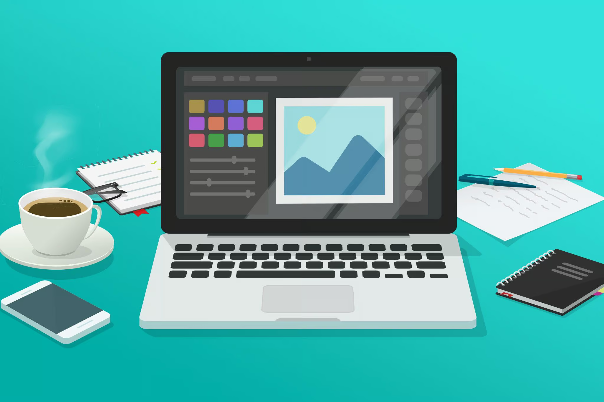
Every website needs great imagery and I’m sure you’ve thought about how to use photography and graphics strategically in your design to both inform and delight the user. What I bet you haven’t done is think about how to use them strategically to optimize site speed.
Let’s start with the obvious. Lots of big images slow down sites. Every image on the page is a file that has to be loaded and big files load slowly. Does that mean you should use fewer images? I can hear your bright little designer dreams dying and the good news is that no, you don’t have to skimp on the visual. You just have to be smart about it.
So how the hell do you plan for an image-heavy site then?
Image File Types
Well first let’s take a look at the most common file types available:
- Joint Photographic Experts Group (JPEG or JPG):
- JPGs use lossy compression which gives them a nice small file size. The trade-off can be a loss of quality, but this is often unnoticeable when used for photographs.
- JPGs do not support transparency.
- Best for: Photographs
- Graphics Interchange Format (GIF):
- First off, it’s pronounced gif and I will fight anyone who says otherwise.
- Gifs are a lossless image format. They support transparency and are fine for simple graphs but are mostly used today for animations.
- Best for: Animations and simple graphics
- Portable Network Graphics (PNG):
- Another lossless image format that also supports transparency. PNGs have now mostly replaced GIFs for graphics due to their superior compression, but they do not support animation. Even with their enhance compression though, as a lossless format, they can have relatively large file sizes.
- Best for: Graphics of photography with transparencies
- Scalable Vector Graphics (SVG)
- This is vector image format so images scale smoothly with no loss in quality.
- Supports interactions and animations.
- Generally smaller file sizes than PNGs but bigger than JPGs. More complex images may lead to larger files and slower loading.
- Best for: Graphics and illustrations that need to be interactive or retain quality at a variety of sizes.
So now that you know more about the file formats we can think about how to use them in your design.
Start by asking, what is the ideal format for each image you want to use.
Sure a photograph saved as a PNG might be a little crisper but PNGs take up a shit tone more file space and can take longer to load so use them appropriately. Does it need to have a transparent background? Does it contain text or graphics? No? Then don’t save it as a fuckin PNG. Chances are the reduction in the quality you get from using a JPG for photographs is going to be negligible and the average user on most sites isn’t going to give fuck.
In that same vein, be selective in where you use graphics with transparency. Keep that shit to a minimum.
| PNG (With Transparency) |
|---|
 |
| 228 kb |
| PNG (No Transparency) |
|---|
 |
| 195 kb |
| JPG (Medium Quality) |
|---|
 |
| 18 kb |
| JPG (High Quality) |
|---|
 |
| 32 kb |
There’s one more wrench to throw into the works, and that’s Icon Fonts.
Icon Fonts are, well, a font made up of icons. They can be a great way to include simple graphics without adding more image files. There are a number of free and premium Icon Fonts available so, before you start making a bunch of custom icons for common applications like menus, social links, etc, consider looking into what existing libraries have to offer.
Images vs Background Images
What’s the difference between a regular image and a background image?
A regular image is an element placed within the page. It takes up space based on its width and height.
A background image, on the other hand, only fills the space its congaing element does. Also, depending on the background’s settings it can repeat, scale and crop in different ways.
Why do you need to know this? Well, when you use an image as a background in your design you can crop and position it just the way you want. On a real website though it’s not that simple.
It’s likely that, since the background is constrained by the sizing of the element it inhabits, things like the aspect ratio and cropping will change as the element size does.
Or, you could set the container size to match the image aspect ratio so the image always fits exactly. Now you may have a problem with the internal content fitting though.
Considerations when using background images
There isn’t going to be a one size fits all solution so when using background images think about the following:
- What is the minimum height you need for the content at the smallest screen size?
- What is the maximum height the element should have?
- Are you ok with the image cropping and scaling outside its original aspect ratio?
- If the image is going to crop and scale, where do you want it to crop/scale from? Base this on where the main focus of your image is.
- Is any part of the image going to conflict with the content as it scales?
While background images are a bit more complicated than a regular static image, they are still a great way to add colour and interest to your design or draw attention to a section, as long as you don’t just plunk them in there and say “fuck it, good enough.”
Takeaways
Use the right file type for each image to get the best quality and smallest file size. Avoid images that will slow down the page speed. Keep in mind the differences between a static image and a background image and how they will behave differently on the page.