
Warning
This article contains language that may be offensive to some readers.
Look, I know you designers love your fonts but you can’t just use whatever the fuck you want for the web.
Honestly, you should consider yourselves lucky with the options you have now. Back in the day you only had like 10 web-safe fonts to choose from. These days you’re practically spoilt with choices.
Picking fonts for your design
Ok, so what fonts should you use? Well, first and foremost there are still some limitations but there are also a shit ton of options out there these days so you shouldn’t have too much trouble finding a good match for your project. Personally, I like to pick from Google Fonts as they are free to use, easy to integrate into your website build, and have a good selection, but there are also plenty of other options, both free and paid, through online repositories. The key is to make sure that they are available as web fonts and that you have the proper licensing.
Ok, but what if you want a specific font that isn’t available as a free web font? Maybe your client’s branding guidelines call for something very specific. Well first you need to see if it’s available in one of the following formats:
- TrueType Font (TTF): an older format developed in the 80’s. Compatible with any browser/version.
- Web Open Font Format (WOFF): developed in 2009, this format provides additional compression. Should also be compatible with any browser/version.
- Web Open Font Format 2 (WOFF2): A version of WOFF with better compression. Not compatible with some older versions of Internet Explorer and Safari so your mileage with vary depending on your target audience. Ideally, you should also include the font as a WOFF of TTF as well, or specify web-safe fallbacks.
- Embedded Open Type (EOT): Developed by Microsoft specifically for embedding fonts on web pages. Only works with Internet Explorer, so fuck that.
After determining if the font comes in the correct format, the question becomes, how much is your client willing to pay for licensing? And depending on the font, are they willing to shell that out on a monthly basis? Ya, that’s right, some fonts are licenced for a certain number of impressions per month so not only do you need to purchase the right tier for their traffic but that cost is continuous. Bet those free alternatives are looking pretty funckin’ good now hu? If cost is an issue for your client, try steering them towards a free alternative that closely resembles their chosen font. It’s not unusual for brands to have approved alternatives for use on the web and your average viewer isn’t going to notice the difference most of the time.
Another thing to consider when choosing fonts for your design is how many you need. The more fonts you use, plus font weights and styles, the more files need to be loaded when the site renders and that can affect site speed. So whether you are using free or premium fonts, keep your selection lean. A good rule of thumb is to have one heading font and one general copy font. From there you can determine how many styles and weights you’ll need to include.
Text size
Now that we have our fonts, let’s also take a moment to look at font units. You’re no doubt familiar with pt and most likely px but do you know they aren’t equivalent? Or that there are other options for font size units when it comes to the web?
Pixels (px): Those little squares that make up your screen. This is generally going to be your standard size unit or point of reference for other units. The “real world” equivalent size of a pixel. Varies depending on dpi. For example, at 96dpi 1px is about 0.026mm while at 300dpi that same pixel is about 0.008mm. This is the reason that things like milometers and inches are completely fucking useless on a screen.
Points (PT): Points are an old-school font unit. 1pt equals about 1.33px which is an annoying ratio so fuck that. I mean up can still use it but why?
EM (em): This is another old-school unit, used back in the printing press days and based on the height of the letter m. This one is still quite useful though as it allows you to set a font’s size as a percentage of its parent element’s font size. For example, you have a section where the font size is 16px. You have a heading that you want to be one and a half times bigger than your body text. Easy, set the heading size to 1.5em.
Root EM (rem): This one is just like em but it bases the size on the root font size which is the base font size set for the body copy on the whole website. So if your root size 16px you can make all your font size settings a multiple of that. This is especially useful for scaling down all your headings for mobile. Something we’ll touch on later.
There are also some wacky things you can do, like make the font size a percentage of the width or height of the section it’s in (%) or a percentage of the width or height of the browser window (vw and vh respectively). These have somewhat limited use cases though.
Headings
As far as the internet is concerned there are 6 heading types and you can’t just throw them in however you like because it “looks good”. Those different headings mean different shit and if you use’em wrong Google just goes WTF and screws over your SEO.
Headings should also clearly define what the content is about. Whether you’re writing the content yourself, getting it from the client or working with a content writer, watch out for Purple Prose. While your human users might be able to figure out that “Our Heart and Soul” means About Us, Google hasn’t a fucking clue. While this is changing, as contextual AI gets better at understanding contextual and natural language, you should still strive to make your headings clear and focus on including keywords over “fluff” to improve SEO.
What are the headings and how should they be used?
H1: This is your page title. It should reflect the main topic of the page. Simple. This should also be the first heading on the page and, like Highlanders, there can only be ONE.
H2: These are the main subsections of the page. Again, they should reflect the content in a meaningful way. No prosey bullshit.
H3 through H6: Subsections of descending importance.
Here are some examples of good and bad heading use:
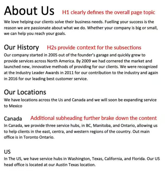
Good Heading Usage
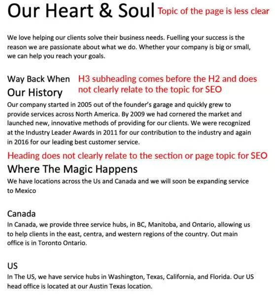
Bad Heading Usage
Dynamic Considerations For Typography
Text Layout And Screen Size
So here’s the thing, the way you’ve layout out the text is only going to actually look that way online at certain screen sizes. As the screen size gets smaller it’s going to disrupt your layout. That paragraph that used to fit perfectly into the space? Ya, it’s got an orphan now. And that heading that looks great on two lines? Now it’s three. That’s the nature of a dynamic canvas so the first step is to accept it that it’s going to happen sometimes. Then, do your best when laying out content to give it the room it needs to reduce when this happens.
For example, putting content into a narrow space in your desktop design can cause it to break to the next line earlier. You can end up with ridiculous looking text like this:
Lorem ipsum
dolor sit
amet,
consectetur
adipiscing elit.
Sed id
pellentesque
velit.
So give your text room to breathe.
Scaling Text For Different Screen Sizes
Ok, so maybe there are certain places where you just can’t live with the way the font stacks. Or you have a long word that breaks the layout on smaller screens. Maybe it just looks like shit.
First off, you could designate smaller font sizes for your heading at certain screen sizes. Maybe at 700px or less your H2’s go from 30px to 26px. Maybe that section next to an image that got supper narrow now spans the full width with the image on top.
Font sizes can also be set with a minimum and maximum so you might want to consider what those would be and include them in your design notes for your developer. Keep in mind the different size units discussed previously and that you can mix and match them. Ex: a heading with a minimum size of 10vw and a maximum size of 70px.
Takeaways
So, to recap, make sure you choose fonts that are formatted for the web and keep your selections lean. Use clear headings and keep the information hierarchy top of mind when layout out content. Finally, remember that you are designing for a dynamic canvas. Your content will shift at different screen sizes so plan for it by giving your text enough room and specifying alternative font sizes to keep things legible.