
Warning
This article contains language that may be offensive to some readers.
When you design something for print, you can just put shit wherever you want on the page. It’s crazy. However, when you design for the web, someone has to take that design and make a copy of it using HTML, CSS, etc, and make it all work on a variety of screen sizes.
Here are some things that can help make this process easier and make your developer not hate you. (I mean, they might still hate you, just not for fucking up the basics).
- Keep a consistent grid size throughout your design. Every page should usually have the same grid width. There are exceptions of course, such as blog page designs. Since blog posts and articles are usually fairly text heavy you might decide to make them narrower to limit the words per line for easier reading.
- In Grid and out of Grid. Just because you have a set grid width, doesn’t mean you’re stuck doing everything inside of it. It’s perfectly ok to have elements that extend beyond the width of the grid. Just keep in mind that at some point those same elements will be viewed on a screen narrower than your grid size and they still have to look good that way too. They will also be viewed at sizes larger than your design and there’s often an upper limit at which out-of-grid content starts to look stupid. Figure out what that limit is and what you want the design to look like when it’s reached.
- The grid can be dynamic. Your grid size can be based on a user’s browser window (and it will be anyway on smaller screens) so you can tell your developer to set it based on a percentage. Again, just keep in mind that you may want to set an upper limit.
- Just like keeping your grid consistent, you also need to set a column system and stick with it. Don’t fuck around and suddenly have an element span of 3.5 columns, choose either 3 or 4. This is a good thing to also consult your developer on. If the site will be built on a CMS, the column system may already be set.
- Define your page margins. If your grid is fixed then the white space to either side will increase in larger windows. If you would rather it remains a fixed width, consider the above option of a dynamic grid width. On the flip side, if you’re fine with a variable margin, consider what you want the minimum margin to be to prevent content from touching the edges on smaller screens.
- How many elements do you place horizontally? There isn’t a set rule for how many things you can stick next to each other. It all depends on what they are. The important thing is to think about what they will look like at smaller screen sizes. For example, how squished can a block of text can they get before it looks ridiculous? At what point are you ok with the elements stacking on top of each other, rather than sitting side by side?
From Desktop to Mobile
There’s plenty of information out there about designing for mobile so we’re not going to get into the nitty-gritty of it. Some of these we will get into in more detail in future articles, but the relevant points are:
- How and when do you want elements to stack?
- Are there elements that should only show on either Desktop or Mobile?
- Are there features that will work differently on Desktop and Mobile?
- How do you want the font sizes to scale?
- How do you want images to shrink and/or crop at different screen sizes?
Ideally, you should always provide a desktop and a mobile version of your design. Thinking from the start about how things will change as the screen size scales up or down will make designing for different devices much easier. It also means nothing is left up to interpretation by your developer who may have a very different idea about how it should look and fuck up your beautifully crafted vision.
Design to Development Handoff
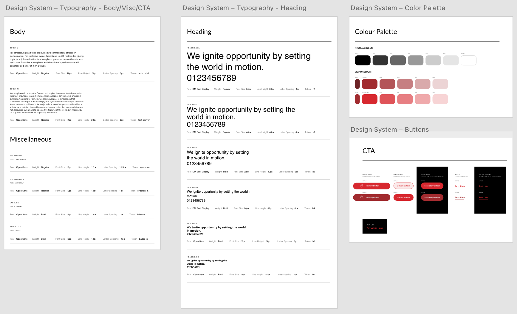
Lastly, don’t just keep all this shit in your head. Create a layout document or annotate your design so that your developer can easily understand what you want. Also, providing a website style guide is a great way to keep all the information consistent and concise. Include things like your grid width and page margins, font styles and sizes, and even information about repeating elements in the design like buttons.
Here is an example of what your style guide could look like:
Takeaway
Set a grid size and column system and use it consistently throughout your design. Consider how many elements you place in a row, what size they will be and how that will affect their content. Think about how your design will shift at different screen sizes and how you want elements to display on desktop vs mobile. Document your layout parameters for your developer for easy handoff.