Brand Visuals
These guidelines were prepared for Hiilite stakeholders, partners, and suppliers who wish to keep the integrity of the overall brand. To help maintain the strength of the brand, follow these guidelines carefully when promoting Hiilite. However, it’s important to remember that these guidelines are here to inspire your creativity, not restrict it.
We welcome suggestions for these guidelines if you have requests, please email: [email protected]
Company
An introduction into who we are.
Vision
To become the best most badass marketing agency in the world.
Mission
Find purpose. Work together. Effect growth.
Core Values
Collaboration.
Purpose.
Positivity.
Badassery.
Growth.
Colour
To ensure our colours remain consistent, always use the values listed here, never really on eye dropper tools or legacy assets for colour accuracy.
Brand Colours
#FF4D00
#7E29ED
#FFAA00
#00CEC8
#80CC1D
Interface Colours
#FFFFFF
#F7F7F7
#DDDDDD
#393939
#282828
Brand Colours
We have structured our Brand colours to correspond to our five departments, which correlate to our core values, to keep everything connected and simple. Our colours should be used as our primary brand identifier.
Orange
Department: Marketing
Brand Value: Collaboration
hex: #FF4D00 | rgb: R225 G77 B0 | cmyk: C0 M84 Y100 K0 | pantone: 1655C + 2028U
Purple
Department: Design
Brand Value: Purpose
hex: #7E29ED | rgb: R126 G41 B237 | cmyk: C68 M79 Y0 K0 | pantone: 266C + U
Blue
Department colour: Technology / Development
Brand Value: Badassery
hex: #00CEC8 | rgb: R0 G206 B200 | cmyk: C67 M0 Y29 K0 | pantone: 319C + U
Yellow
Department: Content
Brand Value: Positivity
hex: #FFAA00 | rgb: R255 G170 B0 | cmyk: C0 M38 Y100 K0 | pantone: 7549C + U
Green
Department: Administration / Leadership
Brand Value: Growth
hex: #80CC1D | rgb: R128 G204 B29 | cmyk: C54 M0 Y100 K0 | pantone: 376C + 375U
Primary

Secondary

Primary Typeface
Our primary typeface is Lato from Łukasz Dziedzic. This comes in 9 weights plus italics. There are also ligatures and alternates available via OpenType menu in Adobe applications. The Hiilite wordmark is a customized version of the Multicolore font. Multicolore can be used in designs, but should never appear close to the wordmark, especially at similar sizes.

Secondary Typeface
Our primary typeface is Lato from Łukasz Dziedzic. This comes in 9 weights plus italics. There are also ligatures and alternates available via OpenType menu in Adobe applications. The Hiilite wordmark is a customized version of the Multicolore font. Multicolore can be used in designs, but should never appear close to the wordmark, especially at similar sizes.

Logo
To ensure our colours remain consistent, always use the values listed here, never really on eye dropper tools or legacy assets for colour accuracy.
Icon

Wordmark

Combomark
The “Hii” Icon
The primary use of the “Hii” Icon is to serve as a visual greeting between Hiilite, our partners, and the public. Refrain from using the ‘Hii’ Icon in isolation unless its association to the Hiilite name and brand has been made clear. When in doubt, use the Combomark.
Representation on Social Channels
When representing the Hiilite brand on Social Media Channels, we ask that you use the ‘Hii’ Icon. In particular, we require that the ‘Hii’ Icon is not deconstructed and the approved mark is represented in Hiilite Orange, white, or an approved variation when applicable for promotional purposes. The approved ‘Hii’ Icon profile images are included in the logo package available for download.
Grouping Icons
The ‘Hii’ Icon may be used alone (when applicable) or alongside other social icons. It should be used at equal size to neighbouring icons. Be sure to maintain its shape, proportions, and provide adequate clear space between logos as defined below.
Clear Space
Whenever the ‘Hii’ Icon is used, it’s important no other graphic element invades its space. This ensures the Icon remains visible and impactful.
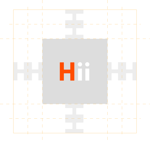
To work out the clear space; Simply transpose the highlighted element (H) around the parimeter of the mark as illustrated above.
Do’s
Maintain shape, colour and proportions
To ensure accurate and consistent use, never alter, rotate, embellish or attempt to recreate Hiilite’s brand assets. The downloads available here are the only approved assets to represent the Hiilite brand.
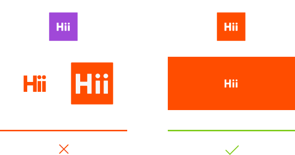
Keep sufficient clearspace
Leave enough space around Hiilite brand assets for them to be clear and uncluttered. Additionally, use assets at a legible size.
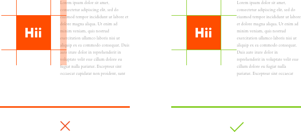
Abide by Hiilite’s Terms and Policies
Agree to act in accordance with Hiilite’s Terms of Service and Privacy Policy.
Dont’s
Don’t modify the design or colour of our assets
Stylizing, warping, or modifying their color or shape is not allowed
If you are unable to use the correct color due to technical limitations, you may revert to black and white
Don’t use any icons or images to represent Hiilite other than what is found on this site

Don’t misrepresent the Hiilite brand
Avoid representing the Hiilite brand in a way that:
Puts the brand in a negative context as part of a script or storyline
Photography
Download the Lightroom presets for quick and consistent photography editing for Hiilite imagery.
Team Photography

Lightroom Presets

Team Photography
We always use high-quality images and never impair photos with paragraphs of copy or graphics. We are an agency filled with creative and highly intelligent individuals who have passions outside of the workplace, and our imagery reflects this.
Photography Settings
Strobe Settings
128.07 // Two Strobes // Beauty Dish + Soft Box
Camera
Sony ILCE-7RM3
Lens
85mm F1.4 DG HSM | Art 016
Compression
5100 x 6715 – 42.99 MB – ARW
ISO
100
Aperture
f/4.0
Shutter Speed
1/250 sec.
Elements
We are constantly evolving. In terms of design, this means fewer rules, which gives the brand a much larger and more vibrant range of self-expression. We do this because we not only have an audience dedicated to clients but a whole creative community. Plus, we gain more power as a result of developing new creative work.
Papercraft

Patterns

Graphics
